
November 27th, 2019
business
There’s more money than ever sloshing around politics. Our latest visual breaks down U.S. presidential campaign expenditures since 1980.

November 26th, 2019
Personal Finance
‘Tis the season for holiday spending. How does your favorite holiday of the year compare to the rest?

November 21st, 2019
social-issues
The U.S. puts more people in prison than any other country in the world, but some states spend a lot more on prisoners than others. See how your state compares to the rest of the country.

November 20th, 2019
Personal Finance
social-issues
Now you need more than $500,000 per year to be in the top 1% of U.S. earners.
November 12th, 2019
The Economy
monetary-policy
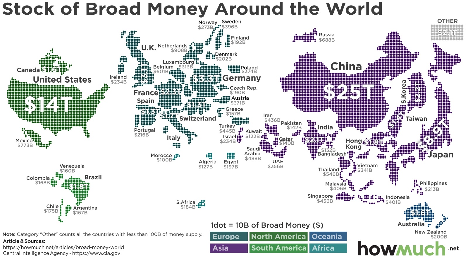
One way to compare wealth between countries is to measure the amount of money currently in circulation

November 12th, 2019
The Economy
You’ve probably read a lot about the national debt in the news. But how does government spending and revenue compare when it comes to individual states?
November 11th, 2019
The Economy
taxes
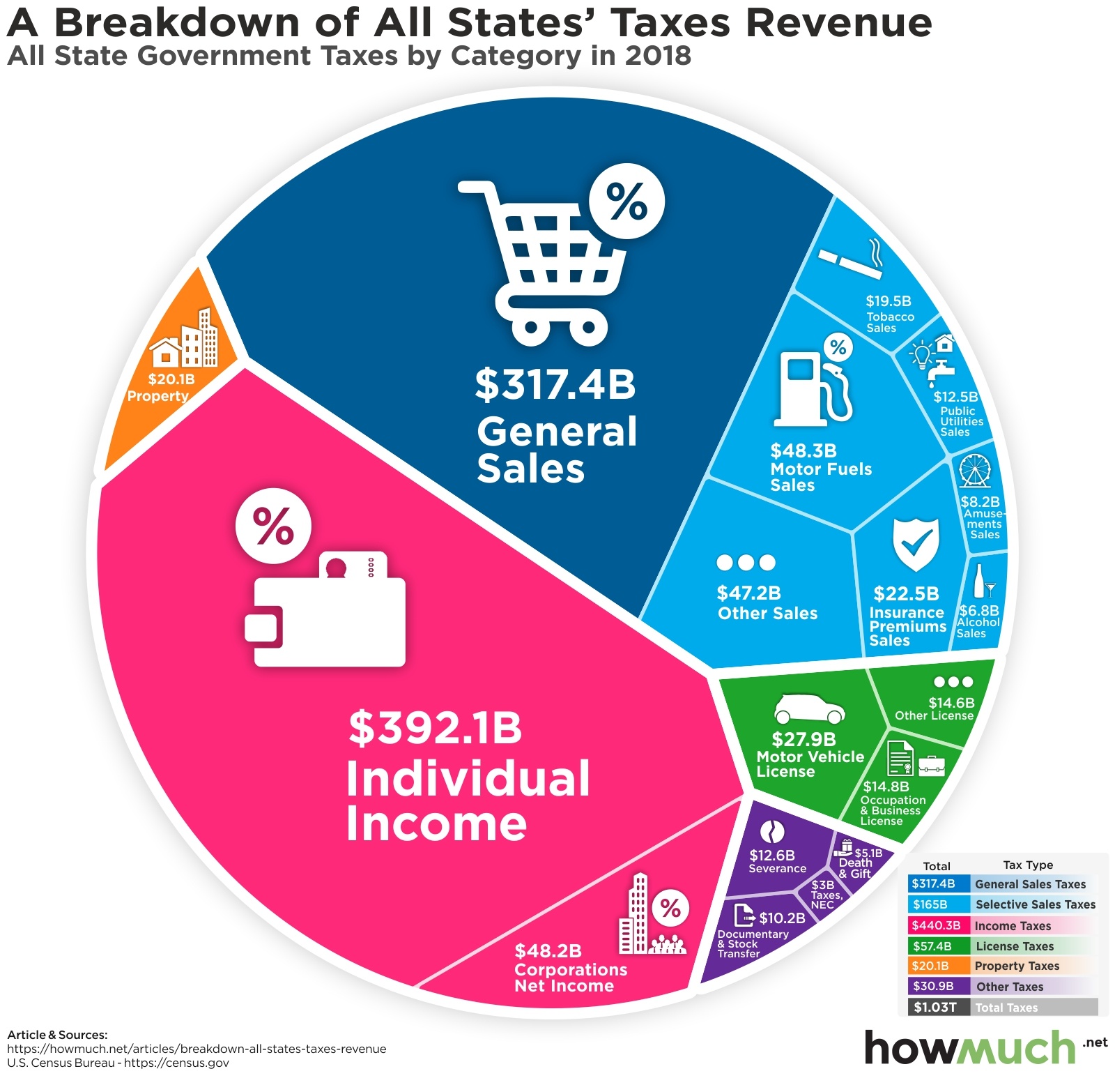
Both the federal and state governments in the U.S. are facing tax shortfalls. Where do states collect their taxes now, and what other revenue sources are presidential candidates suggesting?

November 11th, 2019
The Economy
These 10 visuals will help you make sense of the dynamic and ever-changing U.S. economy
November 6th, 2019
social-issues
Wealth
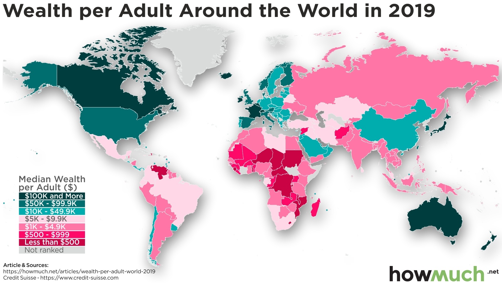
These maps show where the wealthy (and not so wealthy) live around the world

November 5th, 2019
Personal Finance
business
investments
See how much money you’d have today if you invested $100 in these stocks 20 years ago