March 21st, 2019
The Economy
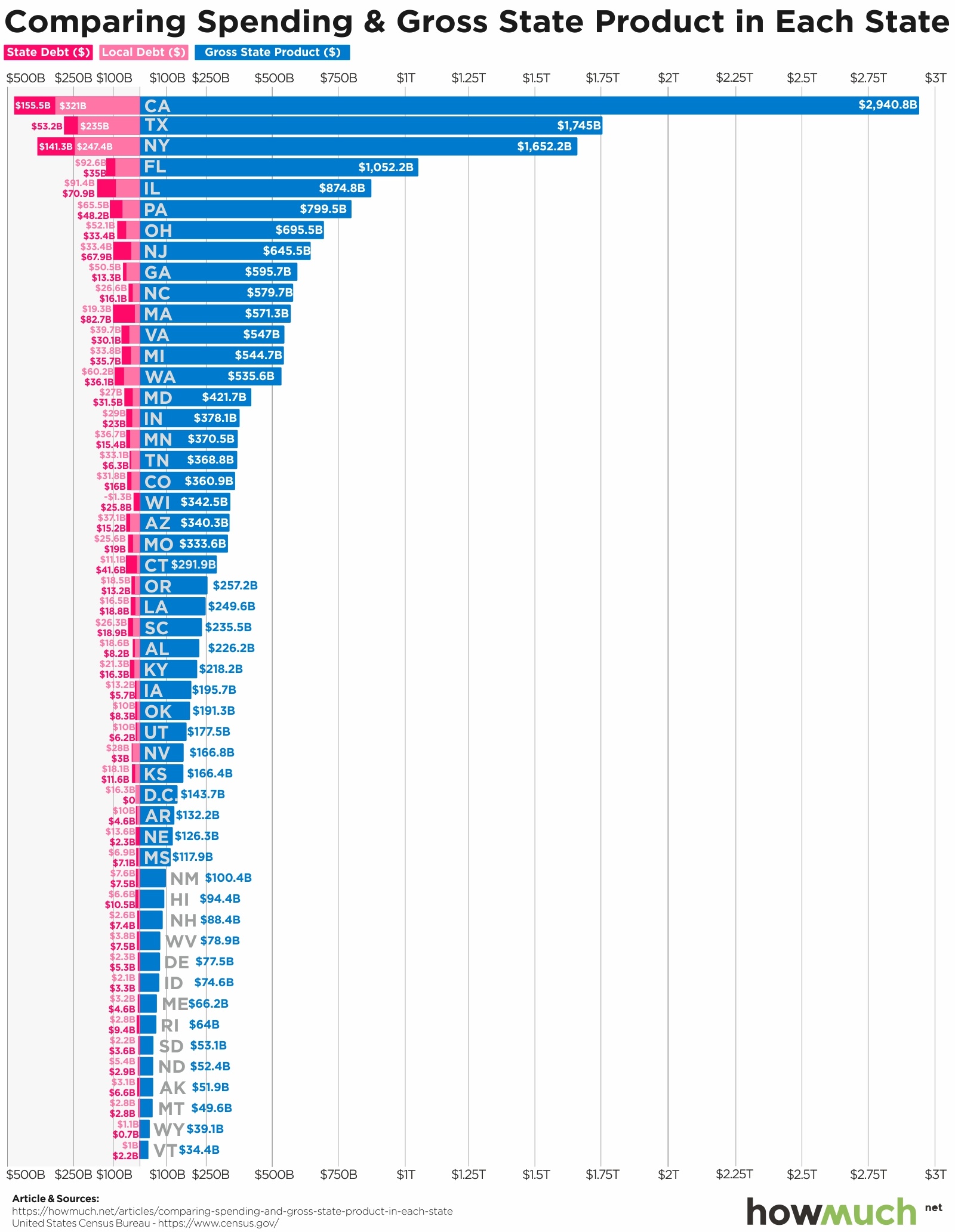
debt
Our latest visualization uses data from the U.S. Census Bureau to compare each U.S. state’s debt to its output

March 18th, 2019
Personal Finance
jobs
This graphic shows the mean yearly income of financial advisors in all 50 states. Their average salaries range between just over $76K in Vermont to more than $166K in New York

March 15th, 2019
Personal Finance
Where you live (and drive) has a huge impact on how much you pay for auto insurance. Our newest visualization breaks down average annual car insurance premiums by state and how some parts of the country are much more expensive for drivers than others

March 6th, 2026
The Economy
The economies of these nations fit like puzzle pieces inside this map of America.

March 7th, 2019
business
Are U.S. banks too big to fail? And how many “big banks” are there really? Our visualization lets you easily compare the size of different banks according to the value of their assets.

March 4th, 2019
Personal Finance
debt
Unsecured personal loans are on the rise in the U.S., but do you know how people are using the money? Our visualization lets you see the most common reasons people take on this type of debt

March 1st, 2019
jobs
Getting a job in technology is supposed to be a surefire way into the upper class. Our new map of average compensation for computer jobs reveals how it can vary dramatically across the country

February 27th, 2019
business
investments
2019 is shaping up to be a major year for companies to go public, but is it worth getting in on the action? Absolutely, if you’re lucky or smart enough to pick some great companies.

February 26th, 2019
The Economy
taxes
Our visualization shows how much money the federal government collects and allocates back to projects in each state, revealing who is shouldering more of their fair share of the tax burden, and who is taking a free ride

February 21st, 2019
The Economy
social-issues
President Trump frequently criticizes how little money other countries spend on global institutions like the UN. Our visualization lets you compare American financial support for the UN with the rest of the world