
February 18th, 2019
Personal Finance
social-issues
The simple truth behind the gender pay gap is it gets worse as workers get older. Our visualization shows how men earn more than women at every age, but just as workers settle into a career, the gap explodes

February 11th, 2019
business
Private fintech companies mean big business, and right now they’re growing in size. Our visualization breaks down the companies and industries getting the most money from investors

February 8th, 2019
Personal Finance
If you’re dreaming about an early retirement, you’ll want to look at our new maps. We reveal how big your nest egg needs to be to retire early in every state for 35, 45 and 55 year olds.

February 6th, 2019
The Economy
jobs
Trump and Obama both claim credit for a strong economy and high job growth numbers. Our visualization shows you the real track record of job growth for each president going all the way back to the Great Depression.
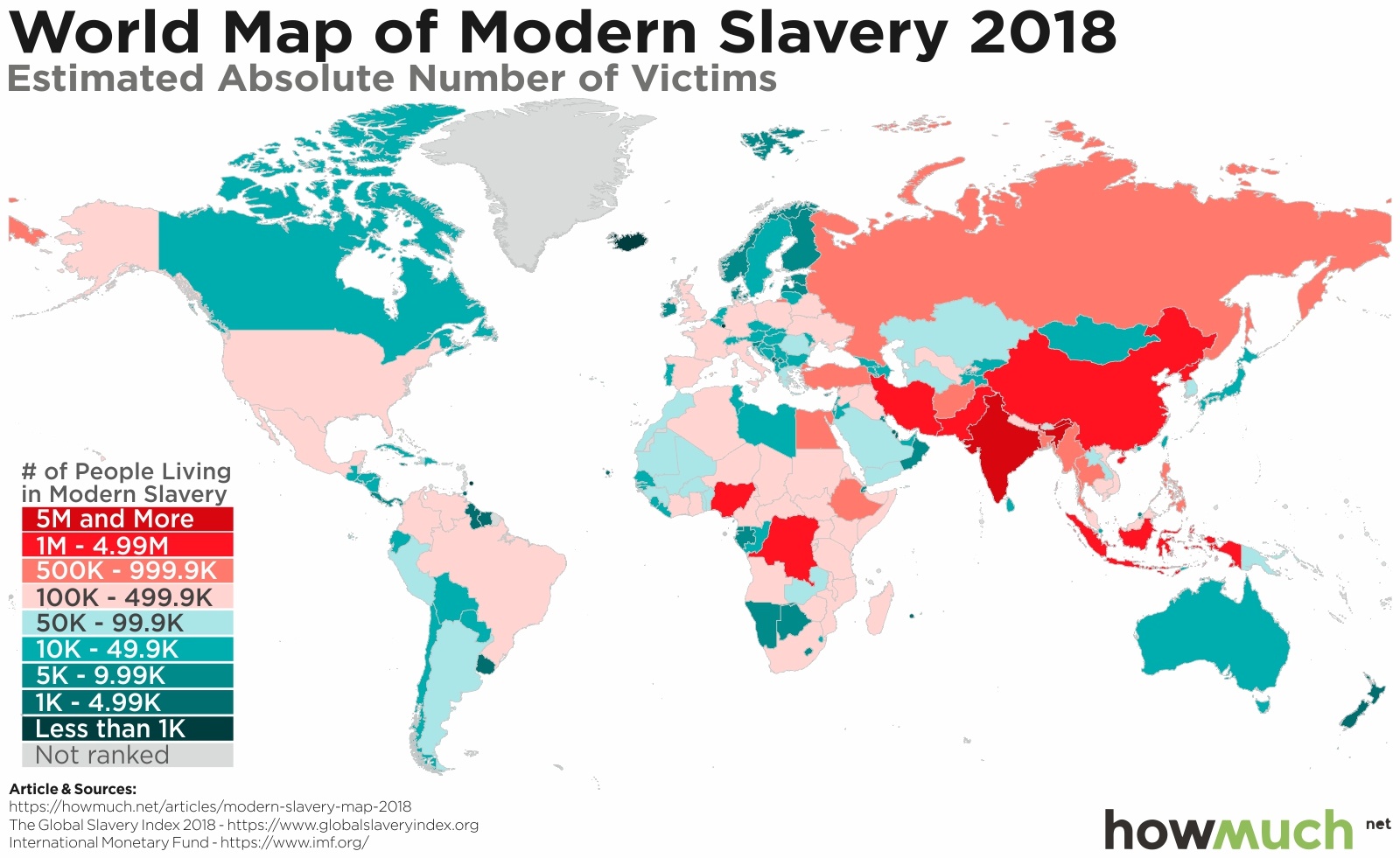
January 31st, 2019
The Economy
social-issues
Slavery is any type of system that forces people to be treated like property, including forced marriage, labor and human trafficking. Our maps shed light on the true extent modern-day slavery around the world today.

January 28th, 2019
The Economy
The U.S. economy is constantly changing. We track the percentage increases and decreases of every major expenditure affecting your life for the past 20 years.

January 25th, 2019
social-issues
The U.S. sends billions of dollars of weapons around the world every year. These maps break down America’s biggest competitors and which countries are the biggest purchasers of weapons “Made in America.”

January 22nd, 2019
The Economy
investments
Foreign direct investment declined in the last several months as the global economy slowed and trade wars heated up. But the U.S. and China still lead the world as overseas capital looks for investment opportunities.

January 21st, 2019
Personal Finance
debt
Americans have taken on over $1 trillion in total credit card debt. Our map shows how long it will take the average borrower in every state to pay it all back.
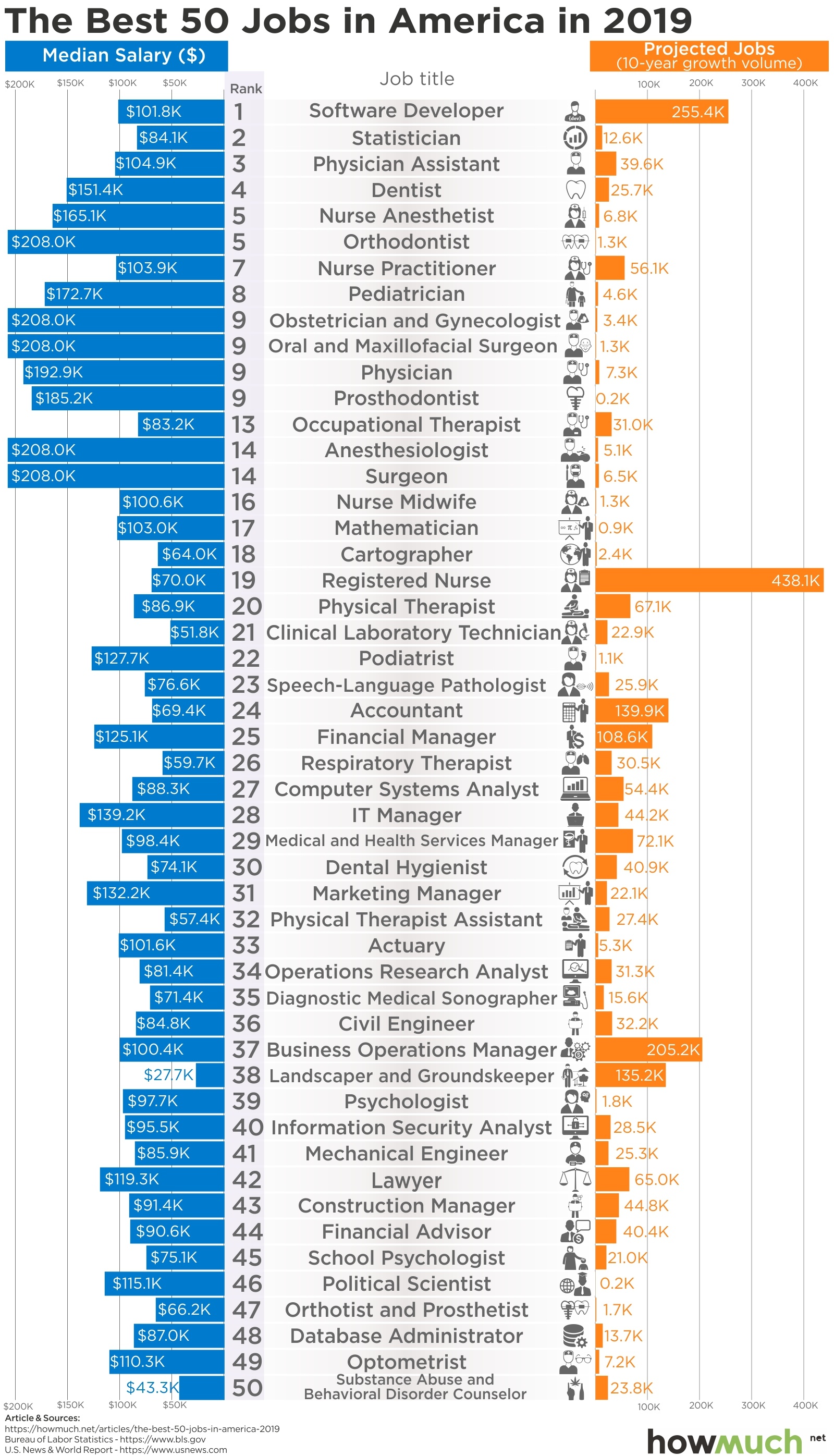
January 18th, 2019
jobs
The best jobs almost always have a few things in common. They are in demand, pay well, and require some degree of training. If you’re thinking about a career change, this visualization is a good place to start.