
December 6th, 2018
The Economy
debt
The U.S. economy is built to run on consumption, and consumption is fueled by debt. Our visualization categorizes household debt, making us wonder how much longer it will take until something bursts

December 3rd, 2018
Real Estate
The economy has recovered since the Great Recession, but the housing market remains below its 2007 peak in some states. See how median home prices have changed over the last 10 years where you live.

November 28th, 2018
business
The largest companies in the world have massive R&D budgets, but not everyone is investing in innovation at the same rate. Our visualization breaks down the top 50 leaders by industry category.

November 26th, 2018
Personal Finance
If you are a new parent putting your baby in childcare, you might be in for a shock. Childcare costs more (a lot more) than college in over half the states in the country.
November 19th, 2018
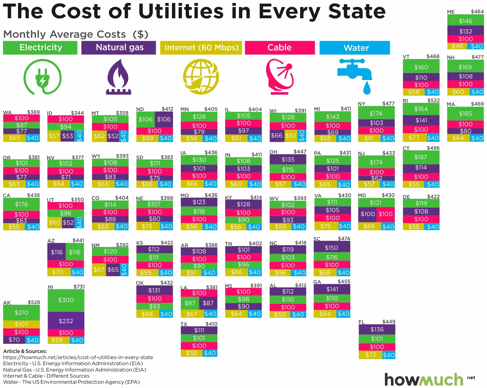
Personal Finance
Unless you live off the grid, utilities are a big part of your monthly fixed budget. Our map breaks down how much Americans spend each month on electricity, gas, water, cable and Internet.
November 19th, 2018
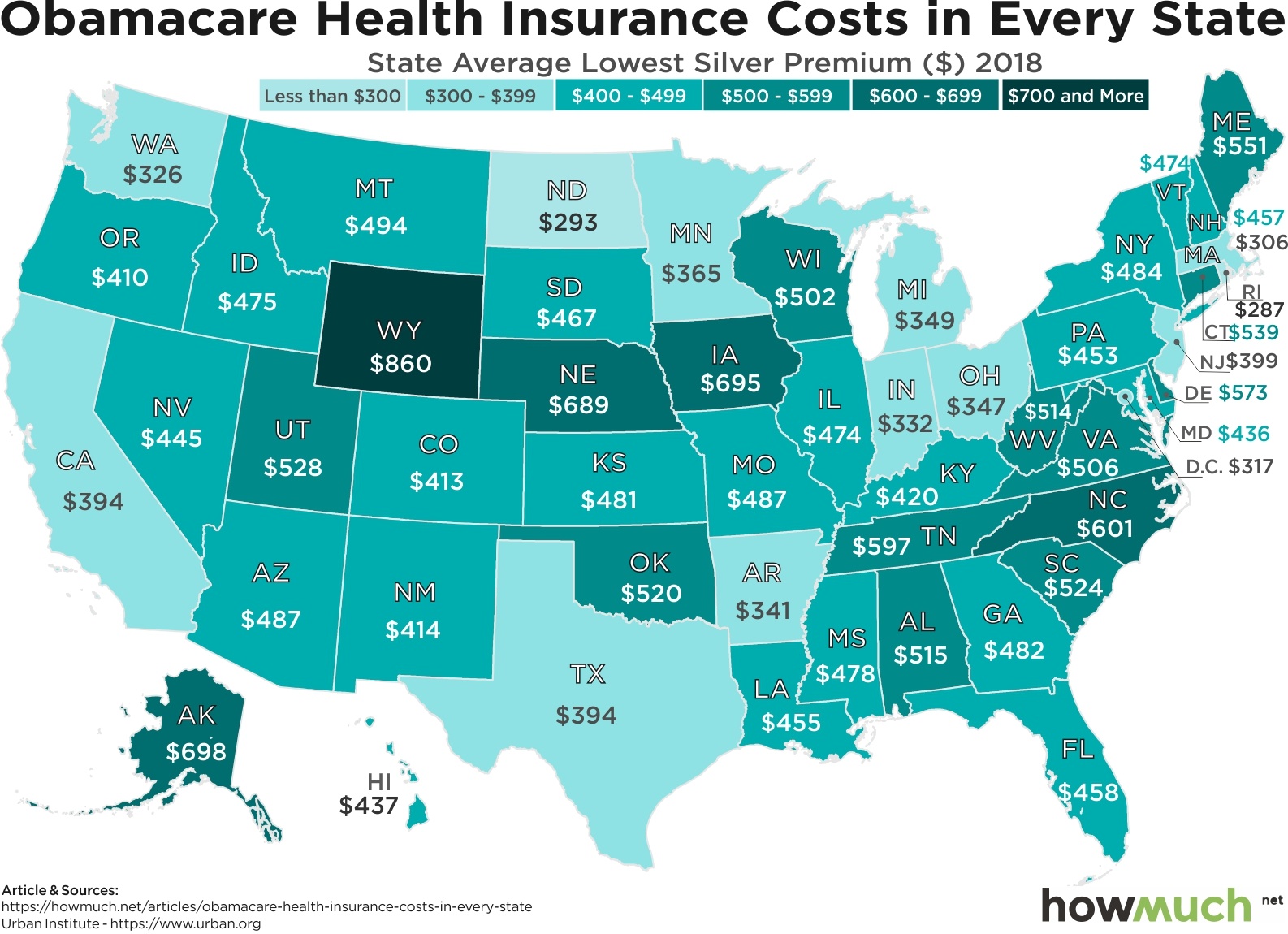
Personal Finance
It’s time for open enrollment for Obamacare, and lots of people are in for a big price shock. Our map breaks down which states have the worst rates in the country for basic silver and gold insurance plans.

November 16th, 2018
Personal Finance
One of the best ways to save money is by switching car insurance companies, but how much should you really be paying for full coverage? Our map breaks down the market for auto insurance in every state across the country.

November 12th, 2018
Wealth
The scale of wealth inequality around the world is just astonishing. Our series of new maps show how people living in the West are on average over 1,000 times richer than people in the poorest parts of Africa.
November 9th, 2018
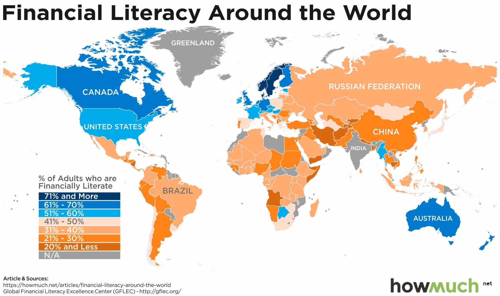
Personal Finance
The Economy
Being financially literate means you understand basic concepts like diversification, inflation and compound interest. Our series of maps indicate relatively few people around the world do.

November 7th, 2018
The Economy
social-issues
Our visualization explores relationship between public perceptions of fairness and the size of every country’s economy