January 16th, 2019
jobs
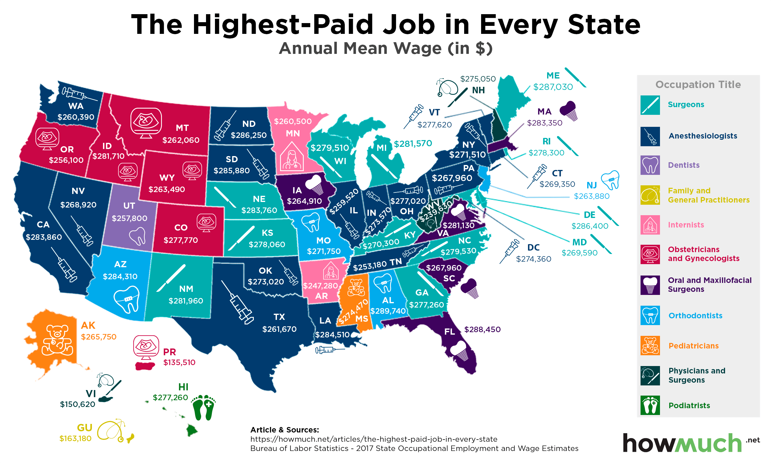
Making a six-figure income is a career milestone for most people, and it turns out the highest paid occupations make substantially more than that. Our newest map shows which jobs pay the best in each state.
January 14th, 2019
The Economy
social-issues
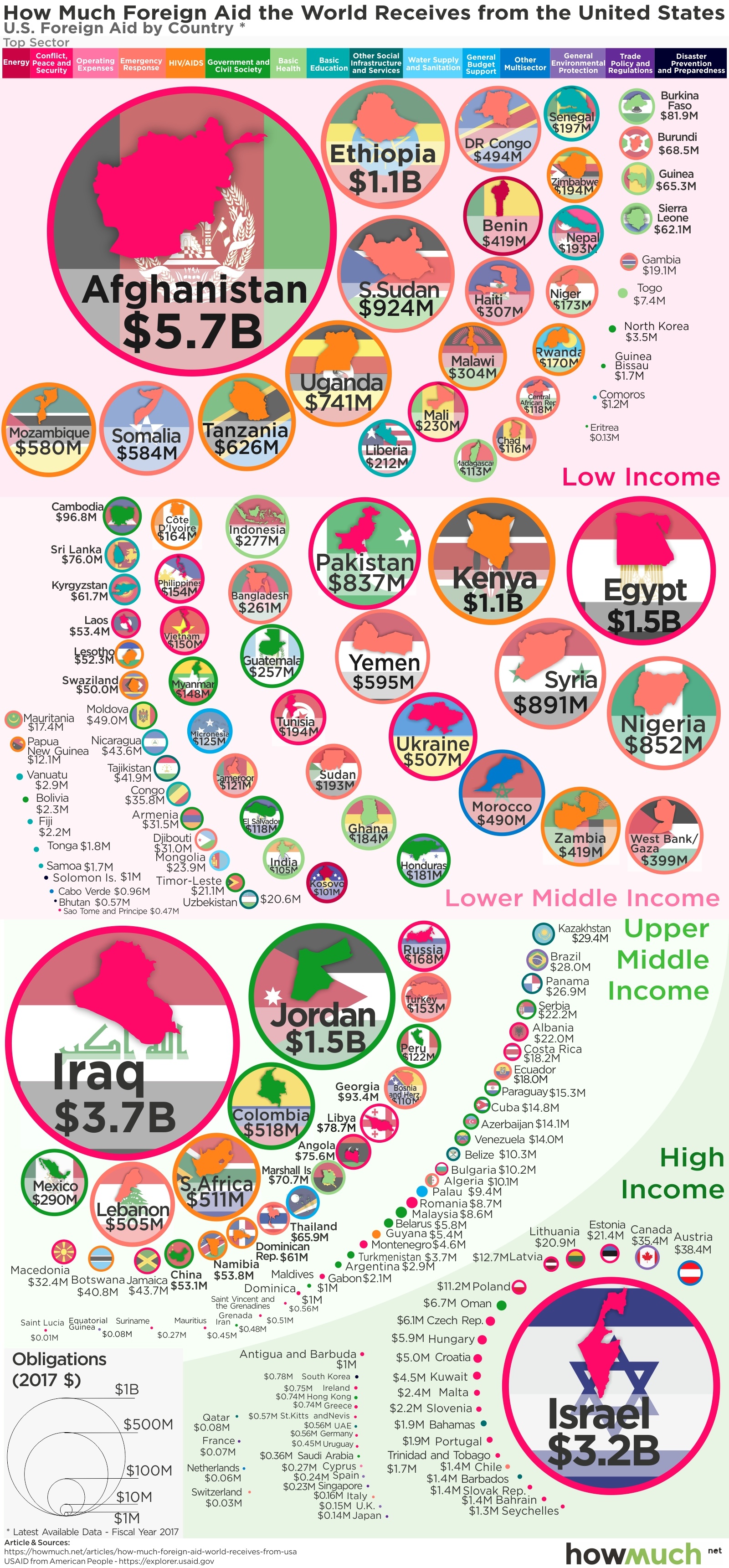
President Trump constantly threatens to cut foreign aid, but he hasn’t changed much over the last 2 years. Our visualization breaks down the countries and issues continuing to receive money during Trump's administration.

January 11th, 2019
The Economy
The best way to compare economies between vastly different sized countries if GDP per capita. Our new series of maps provide a snapshot of the enormous inequality around the world in a true apples-to-apples comparison.
January 2nd, 2019
The Economy
debt
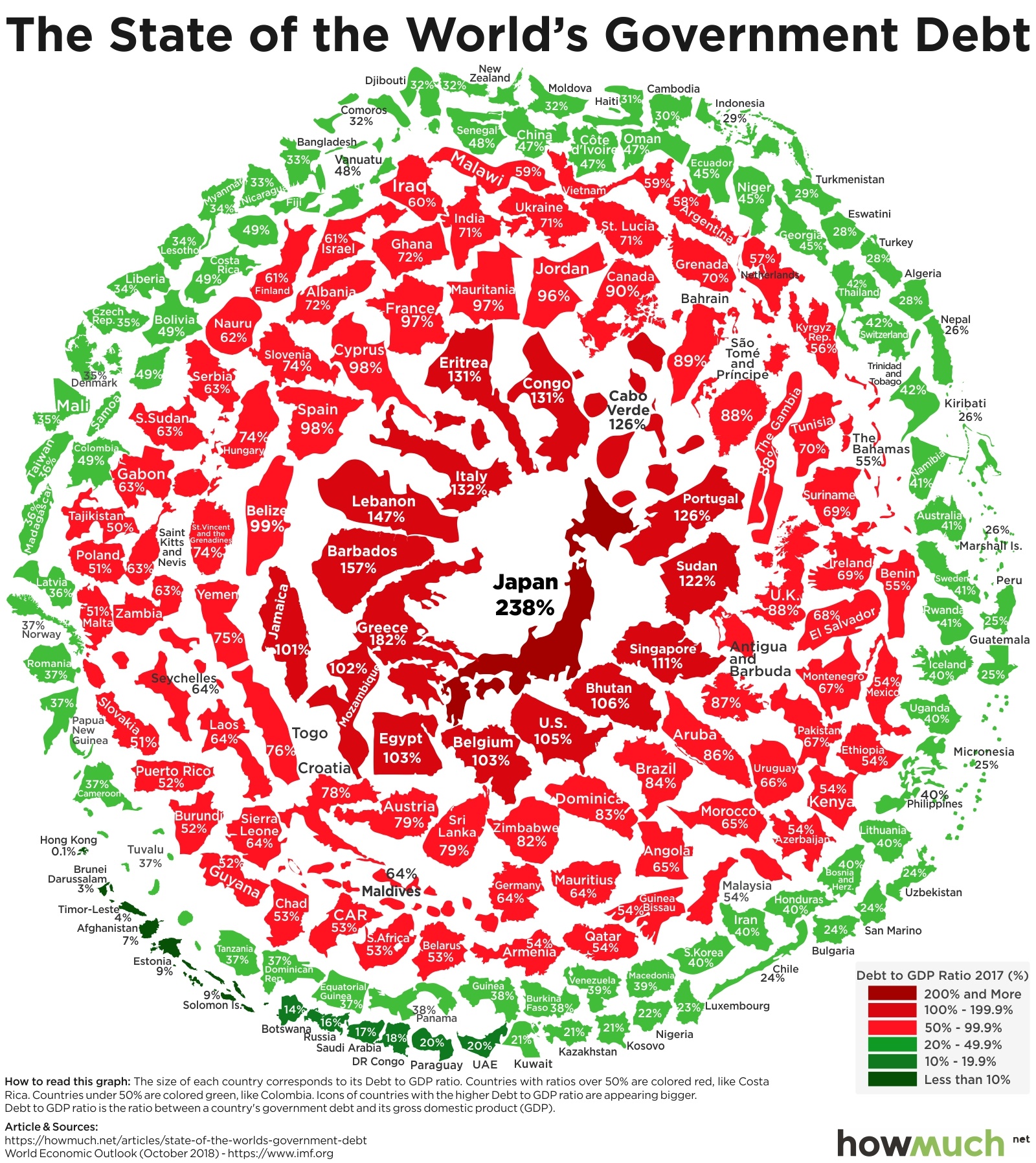
Policymakers have avoided dealing with debt for years, guaranteeing that any resolution will be more painful. This visualization shows which countries have the biggest problems with national debt relative to their economic size.

March 20th, 2026
The Economy
Another year is in the books, and we’re thrilled to present our list of the top 18 visualizations from 2018. Understanding money should be easy, and we aim to make it aesthetically pleasing too. We are humbled by the continued growth of our audience. A big thank you to our readers for a great year, and we wish you all the best in 2019!

December 27th, 2018
Personal Finance
debt
Are young people better or worse off financially than previous generations? Our new visualization creates a snapshot in time of the financial picture for Millennials, Gen Xers and Baby Boomers as each was entering the workforce.

December 19th, 2018
Personal Finance
The middle class is disappearing in the U.S., and yet everyone seems to think they’re middle class. Our visualization highlights how the size of your household plays a big role in determining your class status.

December 17th, 2018
business
Factory jobs are on the comeback, but the best manufacturing companies aren’t always profitable. Our visualization breaks down the top 50 American producers across industries, highlighting the ones with the most revenue and highest profit margins.

December 14th, 2018
Personal Finance
Financial security means paying for basic necessities every month without going into debt. Our newest maps reveal how much money single Americans and new parents need to earn to feel economically comfortable in every state.

December 10th, 2018
Personal Finance
A new ranking from Money Magazine compares the 50 best places to live in the U.S. Our visualization cuts through the noise to let you decide the best place depending on what you think is most important, from income to expenses and job growth.